29 Sept 2010

Colour: Project - Colour relationships

Exercise: Colours into tones in black-and-white
4 photographs

Click here to view album

I set about this exercise using some brightly coloured action figures I own and taking one exposure; the RAW was later used to create the B&W images using Adobe Lightroom. This will prove useful practise later on when using Lightroom for processing images for Assignment 3.

I’m not really too sure what I can say about this assignment as my results are the same as the example given in the course material. Furthermore, I will not be using anything learnt here for Assignment 3 as there is no requirement for submitted black-and-white work. Hopefully this will be something for later on in TAOP.

Click here to view the photo album and read my notes.

Research visit to London

I have been so busy at work and the weather has been so poor recently that I haven't really done much on TAOP course. So, to get myself back into the material I decided to take a day trip into London to looks around some gallery and exhibitions to get myself back into a photography mood.I looked at a lot of artist's work during my trip that took me all over London, including Brixton - yikes.

In this blog entry I will write down some thoughts I had about x2 artist's work (I looked at much more, but that's for another time).

One of my first stops was the photography gallery at the Victoria and Albert museum that boasts its collection to be "one of the largest and most important in the world". Despite their claim they have dedicated only a small room in the museum to display its acquired pieces (around 40) and I was somewhat disappointed. Despite this, a number of pieces really caught my attention and may have an influence on my work for Assignment 3.

An epically scaled and untitled piece from Gregory Crewdson's series "Beneath the Roses" had me staring at it for a very long time. The piece was a staged scene in an American town; taken in the twilight, the frame had a cold blue tint that made it feel very surrealistic. There was was snow on the ground and rooftops of wooden homes, no leaves on the trees and an abandoned playground. Also, bizarrely, there is an open fence and garage door that clearly showed a female figure - she is not letting a vehicle in (even though the garage is too littered to accommodate one), she is merely staring straight at the camera with a most disturbing grin. The piece was very nearly a movie still in its staging, however it is a from a series of photographs that have their own story to tell in an individual frame. It very much interested me as I am quite the fan of the surreal and (morbidly) take an interest in things that lean toward horror. Here is an interesting quote from the artist about the Beneath the Roses series:

'I wasn’t interested in that whole tradition of making a kind of objective portrait of a place through pictures. What I was more interested in was trying to create a language that hovered somewhere between reality and fiction. So I was interested in using this place, this setting, the inhabitants of this town as characters in my own narrative. I should also be clear that I was less interested in literal narrative than I was in trying to explore psychological dynamics through the use of light and colour.'

For TAOP, this work has inspired me to start thinking about possibly setting up (albeit in a somewhat down-scaled version) my own outdoor scenes and using the twilight and/or white-balance for Assignment 3.

Later in my day I went to see x2 series of Kurt Tong's work at the Photofusion gallery in Brixton. The first series of photographs, "In Case it Rains in Heaven", was of Chinese joss paper offerings that are burned for the dead. This held little interest for me as stock photography but I found the second series most intriguing.

"Memories, Dreams; Interrupted" is a series of works which explores the concept of memories. Tong used wet-film techniques that deliberately degrade the roll and digitally reconstructs the image. The result is a series of pictures that certainly aren't perfect but give flashes of colour of broken memories. It very much reminded me of J. M. W. Turner's work using colour to create mood in a painting rather than detail. I have been further inspired for Assignment 3 to not necessarily look for the perfectly focused photograph and perhaps use slower shutter speeds and movement to focus more on colours rather than the subject matter.

*No copyright infringement intended - photographs will be removed immediately upon request

Colour: Project - Colour relationships

Exercise: Colour relationships
7 photographs

Click here to view flickr set

When I can began thinking about this assignment, my tutor’s feedback from Assignment 2 just kept on ringing in my head – specifically the warnings against record shots. I deliberately set about finding colour relationships that we’re manmade, or, more specifically, colours that have been put together deliberately by someone that I’m merely making a record of (that being said, x2 of the photographs could probably be regarded as record shots, but I like them anyway!). The first x3 photographs were taken using J.W. Von Goethe's suggested colour ratios:

1:1 Red: green
1:2 Orange: blue
1:3 Yellow: violet

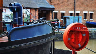
Finding an example of yellow and violet together proved the most difficult to track down and in the end I settled for a flower arrangement. My favourite of the set is the orange-blue photograph below taken at Gloucester docks; I had to use a long focal length to get Von Goethe's proportions right!

Click here to view the photo album and read my notes.

Colour: Project - Building a library of colours

Exercise: Primary and secondary colours
18 photographs

Click here to view flickr set

I decided to tackle this exercise by first considering objects that are dominant in each of the particular colours and set about tracking them down. When I started doing this, I realised that you could break things down in categories and that you could find pretty much any colour you wanted in each. For example;

Plants and flowers;
Red roses, orange tulips, yellow daffodils, green leaves, blue iris, violet phlox (not to mention autumn leaves).

Fruit and veg;
Red tomato, orange carrots, yellow bananas, green apples, blueberries, violet eggplant.

Painted objects;
Red phonebox, orange motorcycle, yellow house, green tractor, blue car, violet wall.

I don’t need to go on (besides, it’s starting to sound like a primary school lesson). With this in mind, I started hunting out colours, seeing if I could get several different hues of each to show colour diversity and (hopefully) capture a ‘pure’ colour.

Click here to view the photo album and read my notes.

3 Sept 2010

Colour: Project - What makes a colour

Exercise: Control the strength of colour
6 photographs

Click here to view flickr set

For this exercise I found a bright orange Kawasaki that was propped up against a fantastic blue sky so I set up the Nikon on my tripod to get a shot that had x2 very strong colours. Below you can see the two extremes of the different apertures from a set of x6 photographs; one over exposed, one underexposed.

You can see that the hue is unaffected across the series as is the saturation; however as less and less light reaches the sensors with the decreasing aperture size the brightness becomes effected. You can see this most clearly with the darkened sky and motorcycle. There is also greater contrast between the colours as the shadows are highlighted in the darker shots.

Click here to view the photos and read my notes.

Assigment 2 - Tutor Feedback

The mixed assessment...

My tutor’s feedback for Assignment 2 gave me a lot to think about for my preparations for Assignment 3: though I had spent a lot of time thinking about and preparing for my Elements of design submission, I was not happy with a number of the photographs and the feedback reflected a number of lessons that are ‘nothing unusual for this stage of the course’.
I had a lot of correspondence and advice following the assessment and a number of questions answered that will hopefully help me produce much better photographs for the colour chapter of TAOP.
Unfortunately, picking my own subject of motor vehicles didn’t really help me much. Though I enjoyed myself going to motor shows with my DSLR a lot of things did not work in my favour.

One of the main things I need to avoid in the next assignment in the use of ‘record shots’, or, more descriptively, capturing someone else’s work in a photograph to satisfy a ‘tick-in-the-box’. For example, a photograph of a Morgan’s bonnet ticks the box for the curves effect; however it is merely capturing the work of the car’s designer. Also, I am guilty of using my Nikon’s auto mode for a couple of the shots so that I could concentrate on the design elements – this results in the camera doing to work and I am only responsible for the framing.

When I am in control of the camera settings, I am not explaining why I am using the aperture and/or shutter speed I have selected. I will need to make more notes in my field notebook at the time of shooting and explain my reasoning in my later work. Also, I will need to include the reason for the choice of white balance for the next chapter of ‘colour’.

On the plus side, I am still experimenting and fully intend to keep doing so – I’m getting better with a few techniques and already have some plans for Assignment 2. Also, a few of the photographs from this assignment are usable for the final assessment - but, before I submit my work, I will be discarding a number of shots and replacing them with better work (with the advice and approval of my tutor).